Subscribe for updates
Connect
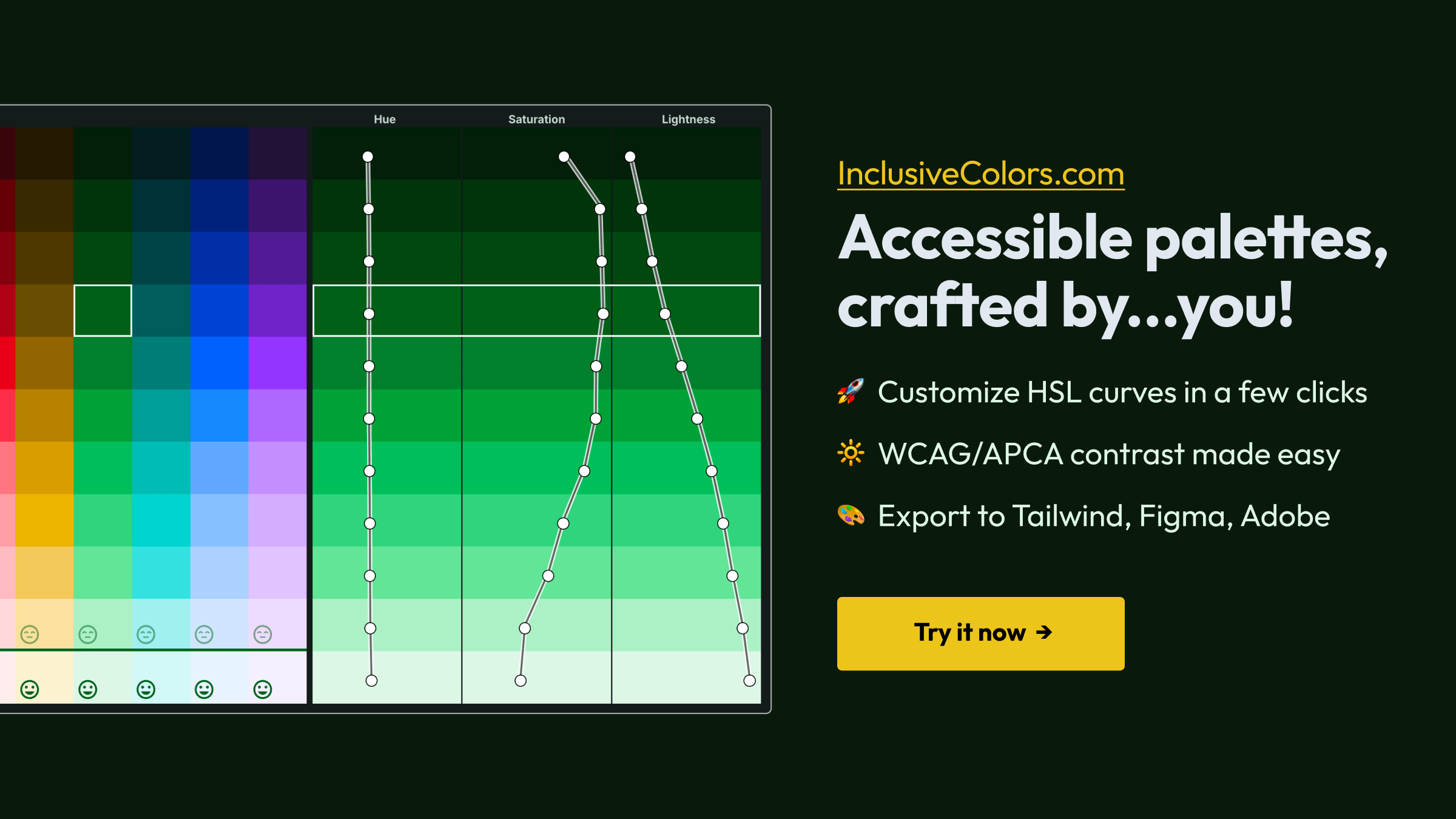
InclusiveColors accessible palette creator (beta!)
 Sean Wilson
What is this?
Hi! This a tool for making custom branded color palettes for web and UI design that are built from the ground up to meet accessible contrast requirements for WCAG, ADA and Section 508. Key features:
- Precise control of every tint/shade rather than being limited by autogenerated colors.
- Instead of only working with a handful of colors, you can create a whole palette of colors at the same time so you can see if they look good together.
- See which color pairs contrast as you edit so you can create a palette with built-in WCAG accessibility. This way you can plan ahead which foreground colors for headings, body text, form fields and so on should contrast on which background colors. You can then create designs with your colors more quickly and with less hassle because you'll already know which color pairs have accessible contrast.
- Lots of export options for palettes so you can import colors into Tailwind, CSS projects, Adobe InDesign/Illustrator/Photoshop, Procreate, Affinity Designer and more.
What color picker is being used? It's HSL?
The tool uses HSLuv for the color picker. HSLuv has the awesome property that modifying the hue and saturation won't impact how bright a color is. This is known as "perceptual uniformity" and makes HSLuv great for exploring accessible color combinations because when the brightness of a color stays the same, so does the color's (WCAG) contrast against other colors.
Most design tools use HSL color pickers which make it more difficult than it should be to pick contrasting colors. With HSL, varying the hue or saturation sliders counterintuitively also changes the lightness and therefore the contrast of the colors, when you might expect only the the lightness slider would do this. HSLuv fixes this confusing behaviour so you can focus on exploring accessible color choices.
Where's the AI features? And autogenerated colors?
There's none! Besides giving you a base to start from, I don't think it's practical to autogenerate all the tints/shades of a branded color palette and have it look just right. Here's a related note from the creators of Tailwind :
If you're wondering how we automatically generated the 50-950 shades of each color, bad news — color is complicated and to get the absolute best results we picked all of Tailwind's default colors by hand, meticulously balancing them by eye and testing them in real designs to make sure we were happy with them.
This tool tries to make picking and tweaking the colors you want intuitive and quick enough that you won't want to give up control to autogeneration magic.
How do I design color palettes? How many colors do I need?
The article from Refactoring UI on Building Your Color Palette is a great introduction on building color palettes for web UIs from the ground up and why you usually end up needing multiple shades of several colors:
In practice, you want 8-10 shades [of grey] to choose from ... Most sites need one, maybe two colors that are used for primary actions, emphasizing navigation elements ... every site needs a few accent colors for communicating different things to the user. For example, you might want to use an eye-grabbing color like yellow, pink, or teal to highlight a new feature ... You might also need colors to emphasize different semantic states, like red for confirming a destructive action ... yellow for a warning message ... or green to highlight a positive trend ... All in, it's not uncommon to need as many as ten different colors with 5-10 shades each for a complex UI.
How to learn more about WCAG accessible color contrast?
Contrast and Color Accessibility from WebAIM is a good straightforward introduction to WCAG accessible color usage. I don't see this mentioned often, but I think accessibility guidelines are intimidating and difficult to apply without practice, where the official WCAG text is especially difficult to follow. So don't be hard on yourself if it takes some time to get your head around it!
What's APCA contrast checking? What's wrong with WCAG2?
Unfortunately, WCAG2 contrast checks have known flaws which WCAG is trying to address in future versions. This isn't well known about within design and development communities yet and can sometimes lead to designers making accessability worse by following WCAG2 recommendations. WCAG2 flaws include:
- False positives: WCAG says certain colors contrast well when they actually don't so it recommends color choices that are hard to read, especially for dark mode palettes.
- False negatives: WCAG says certain colors don't contrast well when they actually do, which artificially limits your color choices.
- Minimal guidance on font choice/size/weight: WCAG lacks guidelines to account for contrast going down rapidily as you reduce font size and weight, so WCAG's color contrast check might pass for smaller text while still being hard to read.
APCA is a more accurate way to measure contrast that aims to address the above flaws in WCAG 2. Some version of APCA may feature in a future version of WCAG ("APCA™ is the candidate contrast method for WCAG 3, and is currently in public beta. WCAG 3 is still in development and subject to changes prior to adoption.").
The APCA contrast guidelines are more complex to get your head around but they more accurately reflect how contrast requirements depend on the type of content being read, such as body text, labels, small headings, large headings, and copyright notices. Read more in Why APCA as a New Contrast Method? and there's also an APCA discussion forum to learn more about applying APCA and give feedback.
How do APCA contrast checks compare to WCAG2?
In the app, you can switch between WCAG2 and APCA contrast checking via the "contrast" menu to explore differences between them. Some things to notice:
- Stricter in general: APCA is stricter than WCAG2 about which color pairs contrast for heading and body text. Most passes for APCA will also pass WCAG2, but not the other way around.
- Color order matters: APCA contrast check values change depending on which color is the foreground color and which is the background color. Generally, APCA says a color pair has lower contrast for a light foreground color on a dark background color, whereas WCAG2 always gives the same contrast value even when the order of the colors are swapped.
- Much stricter for dark themes: Following from this, APCA is much stricter than WCAG2 for what light on dark color pairs contrast, which is really important for dark mode themes. If you compare what WCAG2 says is the lowest passing body text contrast for gray on black (dark mode), and gray on white (light mode), you should see the WCAG2 recommended gray on black is hard to read compared to the recommended gray on white.
- Midtones vs black/white: For midtone colors (between light and dark), APCA and WCAG2 can disagree on if the better contrasting foreground color is black or white. For example, this choice can be important when picking the text color for a button. Orange (a midtone) buttons are often used as an example here, where WCAG2 recommends black text and APCA recommends white text, when white clearly has better contrast.
What tools can I use these palettes with?
Take a look in the "Export" menu to find file format options that will work will other apps and tools. For example:
-
To import into Figma, you can export your palette to Design Tokens Community Group (DTCG) format then
import this into Figma via
this Figma plugin. There's likely alternative Figma plugins that will accept
.cssand.aseexport formats but DTCG format is the recommended approach right now. -
To import into Adobe InDesign/Photoshop/Illustrator, Affinity Designer, Procreate, and many other apps,
use the
.aseexport format. -
A fallback option for design apps is to export an
.svgor.pngimage of your palette, import that into your design app, and grab colors from the image with an eyedropper tool. -
To use with Tailwind, export to
.config.jsfor use with your Tailwind configuration file. - You can export a
.cssfile of CSS variables to use directly in style sheets.
Can I get this as a plugin for Figma or another design tool?
Maybe! Fill out the feature request form to let me know which app and why this would be helpful to you.
Where's the P3/wide-gamut/OKLCH support?
Modern monitors support what's called P3 colors, where they can display extra, and more vibrant colors than typical sRGB only monitors. I'm interested in adding a color space to the app that produces P3 colors like OKLCH but I'm not seeing much adoption of P3 amoungst designers right now: all the style guides I see are still using sRGB/hex colors, and popular design tools like Figma still default to sRGB, although Tailwind v4 did launch with OKLCH colors. OKLCH color pickers can also be tricky to work with, such as the WCAG contrast changing when you edit even the hue and chroma/saturation sliders, which doesn't happen with HSLuv (but HSLuv doesn't support P3). Message me if you have any thoughts on the above and want to try pushing me to add P3 support!
Can you link hue or saturation curves, or use presets curves?
I've had a few requests about linking or using preset hue and saturation curves between swatches but I don't think this would help much. If you look at the example palettes, you'll find the hue and saturation curves for red, green, blue and so on are all fairly unique from each other and don't match typical smooth easing curves. This is partly because color spaces aren't arranged with this in mind, where you wouldn't expect e.g. a saturation curve for red to look right for blue or other colors, or for it to be a perfect curve or straight line.
The editor does have an option though to link lightness curves between swatches because this makes sense within the HSLuv color space, where two colors with the same lightness but different hue/saturation should have the same perceived brightness.
What else have you made?
Take a look my other app, Checkbot: SEO checker, a Chrome extension that bulk checks your web pages for SEO, speed, and security best practices. It has 80K users and a 4.9 star rating.